ARENA
Deliverables
Date
2024
Description
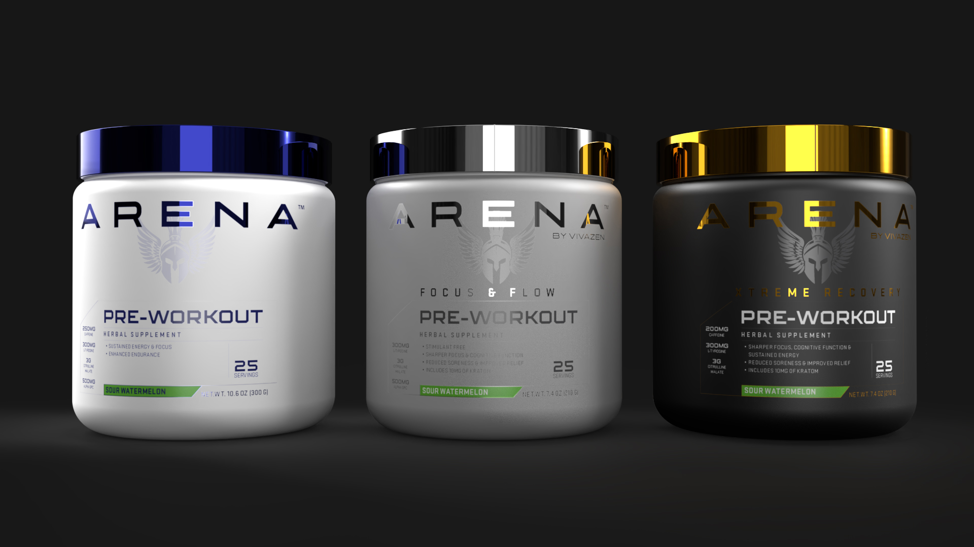
ARENA™ came to me with a clear mission: build a brand any modern warrior would stand behind. I started with the logo — exploring iterations that merged the parent company’s identity with something bolder. The result fused their signature wing elements with a warrior helmet into a strong, iconic mark.
With the identity locked in, I turned to packaging. The logo’s intricacy called for restraint, so I kept everything minimal and geometric — no clutter, no gimmicks. A squared sans-serif complements the logo’s typeface, while varied container shades and contrasting lid colors distinguish each product version. Metallic foil treatments add instant shelf recognition. The final line is bold, upscale, and commands attention.